- A Lesson in User Experience
- Why UX Reigns Supreme
- Balance Between Aesthetics and Functionality
- Bombarding Users with Pop-Ups
- Hopping on Every Design Trend
- Non-Responsive Design Elements
- Low-quality images
- Low Color Contrast
- Accessibility Oversights
- Flat Text Hierarchy
- Navigation that isn’t intuitive
- Unhelpful Error Messages
Most common UX mistakes lead to poor user experience, which ultimately leads to product failure.
The Case of Color Labs: A Lesson in User Experience
Back in March 2011, Silicon Valley veterans Bill Nguyen and Peter Pham started developing a photo-sharing app called Color Labs. Their concept was interesting which was to share photos with nearby users who also had the app.
While it seemed like a potential competitor for Instagram, Color Labs ultimately flopped by October 2012!!
The reason: Poor user experience.
The app was clunky, and the users had a difficult time trying to figure out which button did what. Couple this with privacy issues and the users chose to skip this app on the App Store.
User experience can make or break your app.
The Ever-Crowded App Landscape: Why UX Reigns Supreme
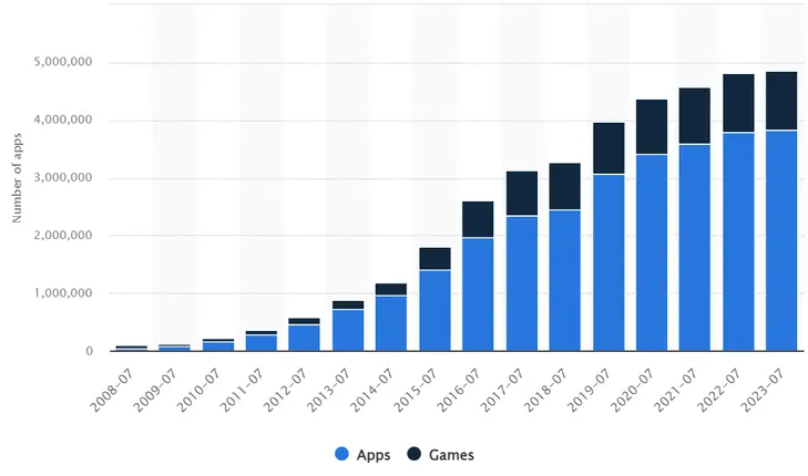
This story highlights the critical role of UX in today's app market. With an estimated 3 million apps on the Apple Store alone (as of 2023), just getting users to install yours is a challenge.
The average smartphone user interacts with only around 30 apps monthly, and the margin for error shrinks even further. To stand out, you need a compelling app idea, a receptive market, a solid monetization strategy, and above all, an exceptional user experience.
Great UX goes beyond aesthetics. It's about intuitive design, clear functionality, and a seamless user journey. If your app feels clunky or confusing, users will delete it faster than you can say "download."
Ten most common user experience (UX) mistakes to avoid while designing your mobile app
#1 Wrong Balance Between Aesthetics and Functionality
Some websites don’t work even if they look great, while others work perfectly despite not being visually appealing. The most important thing is to find a middle ground where aesthetics contribute to function and vice versa.
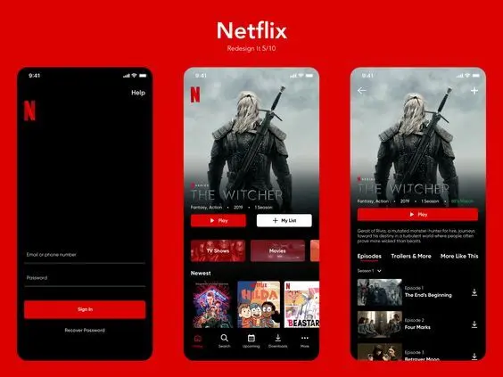
So, how do you make a website attractive? Well, for starters it should be user-friendly with a clear layout and intuitive navigation because people are more likely to like something that they find easy to use. Netflix is the best example of a very aesthetic ui and a very functional ui it doesn't bore anyone at the same time it doesn't feel like it is lacking any features.
However, this does not mean that we should completely ignore visual appeal either. A website may have clean lines or modern designs along with pleasing color schemes which would make them much more inviting than cluttered messes. In fact it is worth noting that good quality packaging can actually enhance products without interfering with their usability.
Also, Read: How to Conduct a Design Audit
#2 Bombarding Users with Pop-Ups
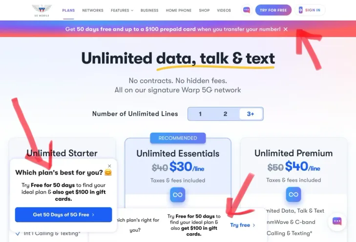
Pop-ups can be good or bad. When used well, they get attention and share helpful offers. But too many make people lose interest. No one likes constant annoying messages on a site. It disrupts the browsing experience and leaves a negative impression.
Use pop-ups with care and a reason. Make sure they give something good to the user, like a discount or a chance to join a special email list. This way, the pop-up becomes a useful tool rather than an unwelcome interruption.
#3 Hopping on Every Design Trend
While keeping your website design fresh can be important, it's crucial to avoid getting caught up in the every new trend. Blindly following every design trend can lead to a confusing user experience. Imagine walking into a store where the layout changes every week ,it would be difficult to find anything, right? The same goes for websites.
Instead, focus on incorporating trends that complement your brand identity and enhance usability. if the design trend improve navigation, make information clearer, or streamline the user journey If not, it might be best to leave it behind. Remember, even the trendiest UI can't compete with a well-designed and consistent one. A timeless, user-friendly design that prioritizes functionality will always outperform a website that sacrifices usability for fleeting trends.
#4 Non-Responsive Design Elements
Imagine you're trying to shove a whole pizza into your pocket - that's what using a website meant for a giant computer screen on your phone feels like.
Websites these days need to be flexible, and should fit any device, phone, tablet, or computer, just like your favorite comfy pair of yoga pants. This is called responsive design, and it's not a fad, it's essential!
People want websites that work smoothly no matter the screen size, and responsive design makes that happen. By adjusting the layout, fonts, and pictures, you make your website easy and enjoyable to use on anything. This means more people sticking around, getting what they need, and leaving happy.
Think of it like clothes that fit well on anyone - responsive design makes sure your website looks good and works great on any device!
#5 Using irrelevant or low-quality images
Ever stumbled upon a website with blurry, pixelated images that seem completely random? These irrelevant or low-quality visuals can actually hurt your message. Imagine trying to explain a complex topic with blurry pictures – it's confusing and ineffective. Similarly, images that don't connect to the content can be distracting and pull users away from your main points.
High-quality, relevant images are like powerful tools that enhance communication. Clear, well-chosen visuals can grab attention, reinforce your message, and make information more engaging. They act like visual explanations, helping users understand complex concepts or simply making your content more enjoyable to consume.
#6 Low Color Contrast
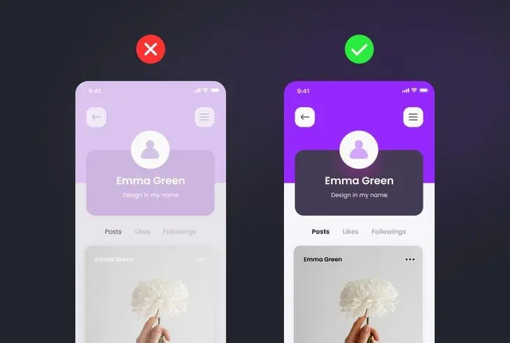
Have you ever gotten frustrated while trying to read something because the text were blending in with the background? That's what happens on websites with low contrast. Light text on a light background, or dark text on a dark background, makes everything mush together. It's annoying for everyone, especially people with vision problems.
Make your blog bright and easy to read by using colors that aren't too similar. Think black and white, or bright colors that pop next to each other. There are even websites that can help you check if your colors work well together.
By using clear colors, everyone can enjoy your awesome blog posts! No more squinting, just happy reading for all!
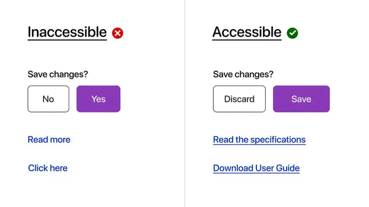
#7 Accessibility Oversights
You worked hard to make your design look awesome and easy to get around. But have you ever thought about how well everyone can actually use it? Sometimes designs can leave out people with disabilities by accident. This could mean things like text that's too hard to see for people with low vision, or pictures without descriptions that can't be read by screen readers for blind people. By forgetting about accessibility, you might be shutting out a whole group of people from using your stuff! The good news is, making your design accessible for everyone doesn't have to be super complicated or take forever. There are actually helpful guides and tools out there to make sure everyone can use your design. Next up, we'll learn some of the most common problems with accessibility and some easy fixes to make your design super inclusive!
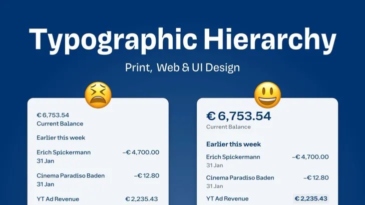
#8 Flat Text Hierarchy
Large blocks of text can be a major turn-off for users, especially those with reading difficulties or short attention spans. It creates barrier that discourages readability. Imagine yourself approaching a dense forest with no clear path – that's how a user might feel facing a wall of text.
The solution lies in creating a clear text hierarchy. This is like building a well-organized park with pathways and signposts. Headings act as main signs, guiding users to the overall topic. Subheadings further divide the content into sections, and bullet points function as clear markers for key points. This structure allows users to easily scan the text, identify relevant sections, and find the information they need quickly. It's like having a map that helps users navigate the content without getting lost in the details. this approach improves readability, enhances information recall, and keeps users engaged with your content.
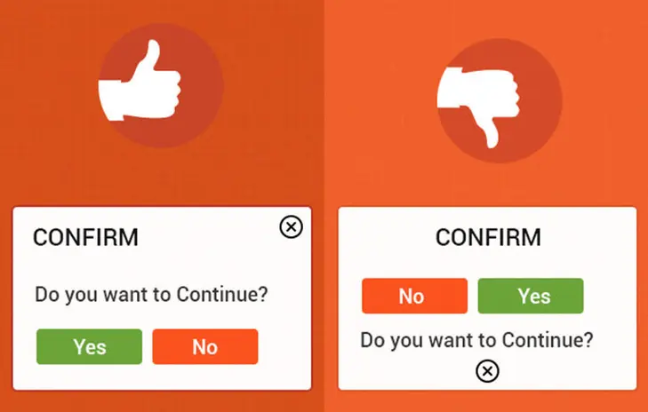
#9 Navigation that isn’t intuitive
Intuitive UI designs are the interfaces that feel natural and effortless to use. Imagine using an ATM for the first time - an intuitive design would be clear and straightforward, with buttons that look like what they do and a layout that follows common sense. Users shouldn't have to spend time figuring out how to use the interface, it should be self-explanatory.
By following principles like discoverability and efficiency , intuitive UIs create a positive user experience. This translates to reduced frustration, increased productivity, and happier users who are more likely to keep coming back.
#10 Unhelpful Error Messages
Error messages are often like cryptic roadblocks on the user's journey. Vague messages like "An error occurred" leave users confused and frustrated, wasting time trying to decipher the problem.
Instead, clear error messages act like helpful guides. They pinpoint the issue in plain language and, whenever possible, offer solutions or steps to get back on track. This empowers users to fix the problem themselves, reducing frustration and saving everyone time. Clear error messages are an investment in user experience, creating a smoother journey and happier users.
There you go. 10 UX mistakes that you can avoid while designing a mobile app or a website. If you feel you have some more tips that will help UX designers and developers out there, do drop a comment below.
Frequently Asked Questions
Have a product idea?
Talk to our experts to see how you can turn it
into an engaging, sustainable digital product.


