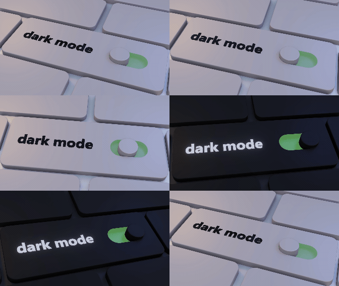
A recent study by the Nielsen Norman Group, involving 115 mobile users, asked about their preferred mode for their devices. Around one-third said they like dark mode as the user interface, another one-third preferred light mode on their favorite devices, and the rest said they use a mix of both modes. In this blog, we'll delve into the ongoing debate between light mode and dark mode by examining their respective advantages and drawbacks, along with real-life examples of both modes implemented in various MNCs for their business growth and wider reach.
Unlocking a Brighter View: A Step-by-Step Guide to Light Mode
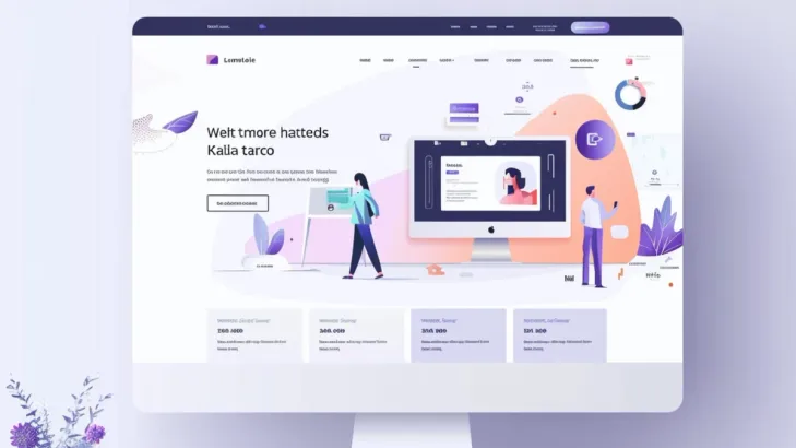
Light Mode, also known as "Light Theme" or "Day Mode," refers to a user interface design scheme characterized by predominantly bright backgrounds and dark text. In Light Mode, the content typically appears on a light-colored background, which may be white or a pale shade of gray, while text and other elements are displayed in darker colors, often black or a deep shade of gray.
Users who prefer a bright, tidy, and familiar visual experience reminiscent of printed materials like books and newspapers favor Light Mode, which is frequently associated with traditional design aesthetics. This mode is typically used in applications, websites, and operating systems where readability and visual clarity are paramount, especially in well-lit environments.
Features of Light Mode
Below, we'll delve into the various attributes that define light mode interfaces, offering a detailed exploration of each feature:
High Contrast:
Light mode employs a stark contrast between foreground and background elements, enhancing readability and visibility of content, particularly in well-lit environments. This feature ensures that text and graphics stand out clearly against the lighter background, reducing eye strain and improving the overall user experience.
Modern Aesthetic:
Light mode embodies a modern aesthetic characterized by clean lines, minimalist design elements, and a sense of spaciousness. This contemporary visual style appeals to many users and is well-suited to applications where a sleek, professional appearance is desired, such as productivity tools, social media platforms, and communication apps.
Accessibility:
Light mode typically employs dark text on a light background, creating a high level of contrast. This strong contrast enhances the visibility of text, making it easier for individuals with visual impairments, such as low vision or color blindness, to distinguish between text and background elements.
Common Default Setting:
In many applications and operating systems, light mode is the default interface option. This means that when users first interact with the application or system, they encounter the light mode interface unless they specifically choose to switch to dark mode.
Benefits of Light Mode
Enhanced Readability:
Light mode's characteristic high contrast between bright backgrounds and dark text ensures optimal readability, particularly in well-lit environments such as during daylight hours. This stark contrast facilitates effortless reading, allowing users to consume content with ease and clarity.
Familiar Default Setting:
As the default interface option in many applications and operating systems, light mode offers users a familiar and intuitive experience right from the start. This familiarity enhances usability, as users can navigate the interface confidently without the need for adjustment or customization.
Visual Clarity:
The combination of bright backgrounds and dark text in light mode interfaces contributes to visual clarity, making it easier for users to distinguish between interface elements and navigate the interface efficiently. This clarity promotes a seamless user experience, ensuring that users can interact with the interface smoothly and without confusion.
Potential Eye Strain Reduction:
While individual experiences may vary, some users find that light mode interfaces help reduce eye strain during extended periods of use. The bright backgrounds and high contrast text may contribute to a more comfortable viewing experience, allowing users to engage with the interface for longer periods without experiencing discomfort.
Drawbacks of Light Mode
Glare Issues:
In extremely bright environments, light mode interfaces may suffer from glare, making it difficult for users to view the screen clearly. This glare can be distracting and may negatively impact the usability of the interface, particularly in outdoor or well-lit indoor settings.
Low-Light Discomfort:
Conversely, light mode interfaces may cause discomfort in low-light environments, such as dimly lit rooms or at night. The bright backgrounds can be harsh on the eyes in such conditions, potentially leading to eye strain or discomfort for some users.
Battery Consumption:
On devices with OLED or AMOLED displays, light mode interfaces may consume more battery power compared to dark mode interfaces. The bright backgrounds require more energy to display, leading to faster battery drain and potentially reducing the device's overall battery life.
Reduced Contrast:
Light mode's brighter backgrounds often result in reduced contrast between text and background, posing challenges for users with visual impairments. This diminished contrast can make it harder to discern text, causing readability issues and potentially excluding users who rely on higher contrast settings for better accessibility.
From Blaring Light to Restful Night: Mastering the Basics of Dark Mode
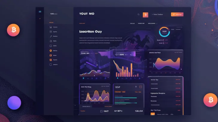
Dark mode, also known as night mode or dark theme, is a user interface option that switches the typical bright background of applications and websites to a darker color, often black or shades of gray, with lighter text and graphical elements. In dark mode, the overall appearance of the interface is inverted compared to traditional light mode interfaces.
According to EarthWeb, in 2024, the dark mode theme will be utilized by 81.9% of smartphone users. Dark mode is primarily designed to reduce eye strain, particularly in low-light environments or when using devices for extended periods, such as during nighttime usage. The darker background lessens the amount of light that the screen emits, making it easier on the eyes and possibly improving readability, especially for those who are sensitive to bright light.
Features of Dark Mode
Dark Background:
Dark mode's primary characteristic is its background, typically presented in black or dark gray tones. Users can choose this option for a more subdued visual experience, which lowers the overall brightness of the screen and creates a more comfortable viewing environment, especially in low light.
Lighter Text and Elements:
In dark mode, text and graphical elements contrast against the dark background by being displayed in lighter colors. This ensures readability and visibility, maintaining clarity and preventing strain on the eyes, even in dimly lit environments or during nighttime usage.
Energy Efficiency:
Dark mode contributes to energy efficiency, particularly on devices equipped with OLED or AMOLED displays. By utilizing darker backgrounds and minimizing the display of bright colors, it reduces power consumption, extends battery life, and promotes sustainable usage habits.
Reduced Distraction:
Dark mode can aid in minimizing visual distractions, allowing users to focus more effectively on the content at hand. By toning down bright colors and backgrounds, it creates a less intrusive interface, promoting productivity and concentration during tasks.
Benefits of Dark Mode
Reduced Eye Strain:
Dark mode's dimmer display reduces eye strain, especially in low-light conditions, offering a more comfortable viewing experience for users, particularly during nighttime usage or in dimly lit environments.
Improved Battery Life:
By utilizing darker colors that require less power to display, dark mode enhances battery life, particularly on devices with OLED or AMOLED screens, leading to prolonged usage without the need for frequent recharging.
Enhanced Visibility:
Light-colored text and elements stand out against the dark background, improving readability and reducing the strain on the eyes during the night.
Reduced Disruption:
In low-light environments, dark mode's subdued lighting minimizes disruption and discomfort, creating a more soothing and immersive user experience, particularly at night or in darkened surroundings.
Drawbacks of Dark Mode
Limited Applicability:
Dark mode may not be suitable for all situations, such as outdoor usage in bright sunlight, where a light mode may offer better visibility and usability, limiting its effectiveness and versatility across different environments and contexts.
Potential Contrast Issues:
Some color combinations in dark mode may lack sufficient contrast, leading to readability challenges, especially for users with visual impairments or in certain lighting conditions, hindering the accessibility of content.
Adaptation Time:
Users may require an adjustment period when transitioning between light and dark modes, experiencing initial discomfort or disorientation until they become accustomed to the new interface, potentially impacting usability and user satisfaction.
Color Accuracy Concerns:
Dark mode can compromise color accuracy, particularly on devices with less advanced display technology, affecting the fidelity of images and graphics and diminishing the overall visual experience for users who prioritize color accuracy.
You can also check out: Pronto: An Inventive Approach to Redefine Dating in India
Light Mode vs. Dark Mode: Which Side of the Display Force Are You On?
How they affect Visualization?
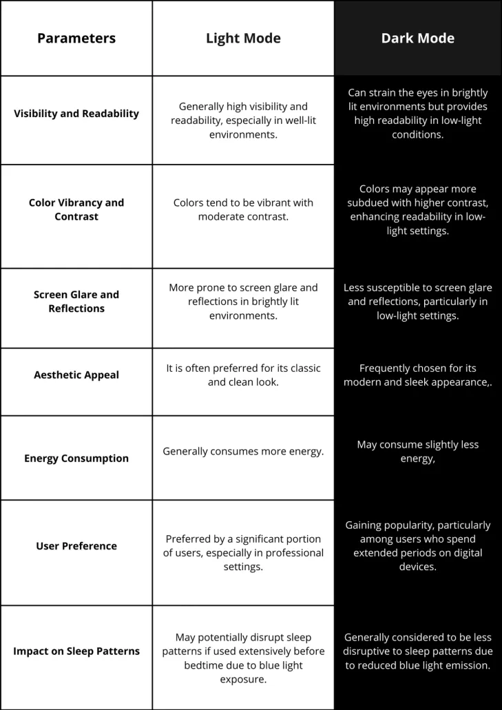
Light mode and Dark mode have contrasting effects on visualization. Light mode typically offers high visibility and readability, making it suitable for well-lit environments. Colors in light mode tend to be vibrant with moderate contrast, providing a classic and clean aesthetic appeal. However, it can be susceptible to screen glare and reflections, particularly in brightly lit settings, which may strain the eyes.
On the other hand, dark mode enhances visualization in low-light conditions by reducing screen glare and reflections, thereby improving readability. It often employs higher contrast and subdued colors, resulting in a sleek and modern appearance. While dark mode may consume slightly more energy, especially on devices with OLED screens, it is gaining popularity among users who prefer its reduced blue light emission and potential benefits for sleep patterns.
Ultimately, the choice between light mode and dark mode depends on individual preferences and the specific visual environment in which the device is used.
Which one should I choose between Light Mode and Dark Mode?
Ultimately, the decision between light mode and dark mode depends on several factors, including user preferences, context of use, accessibility considerations, and aesthetic appeal. Here's a breakdown of both modes based on these factors:
User Preferences
Light Mode:
Preferred by users who appreciate a classic and clean aesthetic. It's suitable for those who spend most of their time in well-lit environments.
Dark mode:
Users who prefer a contemporary and sleek appearance prefer dark mode. It's suitable for those who work in low-light environments or prefer reduced eye strain.
Context of Use
Light Mode:
Ideal for applications used predominantly during daylight hours or in brightly lit environments.
Dark Mode:
Best for applications used during nighttime hours or in low-light environments, such as reading in bed or working in dimly lit rooms.
Aesthetic Appeal
Light Mode:
Provides a classic and timeless look that aligns well with traditional design principles.
Dark Mode:
It offers a modern and sleek appearance that appeals to users seeking a contemporary design aesthetic.
Impact on Sleep Patterns
Light Mode:
May potentially disrupt sleep patterns if used extensively before bedtime due to blue light exposure.
Dark Mode:
Generally considered to be less disruptive to sleep patterns due to reduced blue light emission, making it preferable for nighttime use.
Consider these factors in the context of your specific application and target audience to make an informed decision about whether to implement light mode, dark mode, or provide users with the option to choose based on their preferences and needs.
Real-Life Examples of Light and Dark Modes in Digital World
In this section, we'll dive into some of the most prominent cases where top companies globally have expressed their preferences for either light or dark mode:
Amazon:
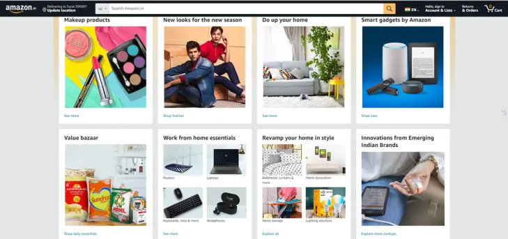
Amazon, the e-commerce giant, initially provided a traditional light mode interface across its platforms. However, recognizing the growing popularity of dark mode among users for its reduced eye strain and improved battery life on OLED screens, Amazon introduced a dark mode option for its mobile app in 2020. Despite this addition, the default preference remains the light mode. Users can manually switch to dark mode through the settings if they prefer.
BBC (British Broadcasting Corporation):
The BBC, known for its comprehensive news coverage and diverse content offerings, primarily adopts a light mode interface across its website and mobile app. However, users who prefer Dark mode may resort to browser extensions or third-party tools to achieve a darker appearance for their browsing experience.
Spotify:
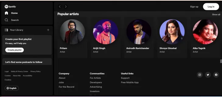
Spotify, the popular music streaming service, has historically embraced a dark mode interface by default across its platforms. This choice aligns with the immersive music listening experience and minimizes distractions for users. However, in 2015, Spotify introduced a light mode option for its desktop app, giving users the flexibility to switch between light and dark themes based on their preferences and visual comfort.
Netflix:
Netflix, the leading subscription-based streaming service, has long favored a dark mode interface as its default preference. This decision is strategic, as it enhances the cinematic viewing experience by reducing glare and emphasizing the content being watched. While Netflix doesn't provide a native light mode option, users seeking a brighter interface may explore browser extensions or third-party solutions for customization.
Conclusion
The debate between light mode and dark mode has provided valuable insights into user preferences, visual comfort, and potential benefits for device battery life. While both modes offer distinct advantages and cater to different user preferences, the future scope of this discussion suggests a continued evolution towards customizable interfaces that empower users to tailor their digital experiences according to their needs and preferences.
At SoluteLabs, our commitment lies in our proficiency in providing UI/UX design services. We focus on not just pinpointing areas needing enhancement but also on executing strategic resolutions that harmonize with your business goals. This guarantees a user experience that deeply connects with your audience, cultivating enduring loyalty.
Frequently Asked Questions
Have a product idea?
Talk to our experts to see how you can turn it
into an engaging, sustainable digital product.

